Published on 3/15/2018
1.
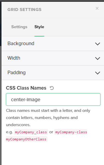
- Will begin with adding CSS CLass Name to the “Grid” element. For example, “center-image”.
- Open Chrome devtools and navigate to the DOM-element with that given class name.
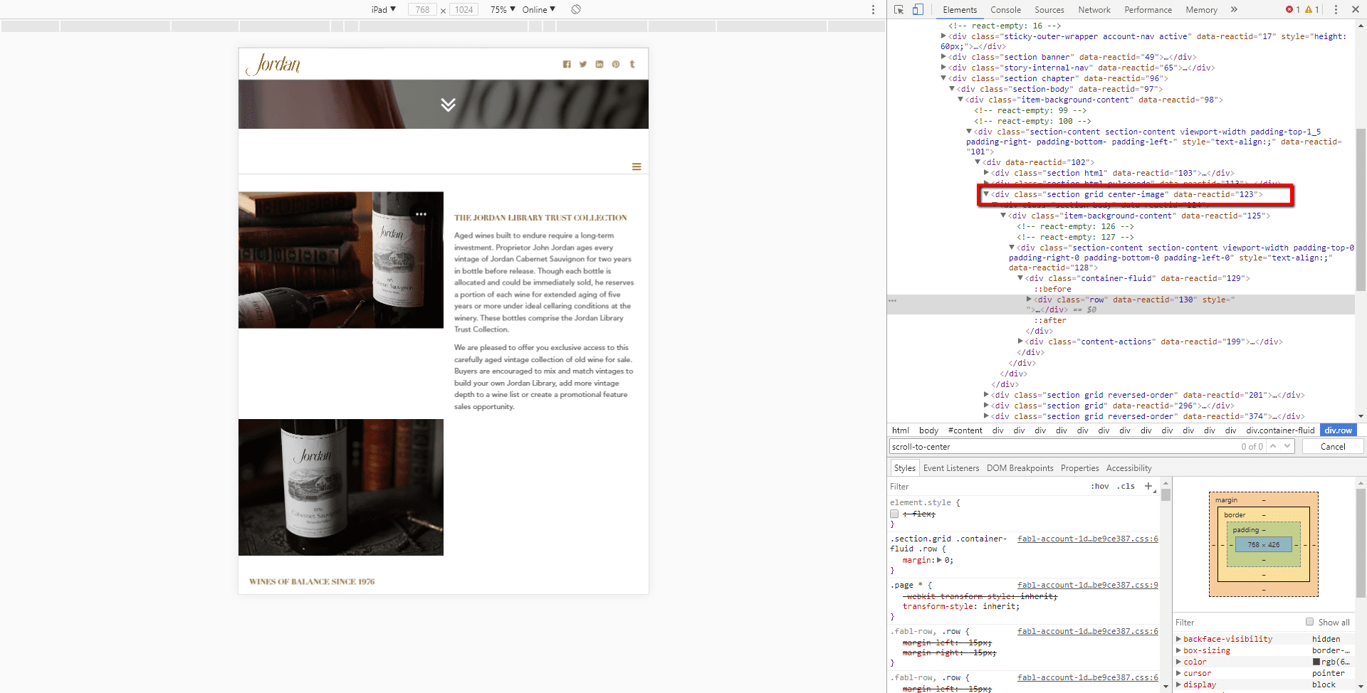
- Then you need to navigate to child elements with class names “row” and “col-sm-6”. So, finally you will have two CSS selectors:
".section.grid.center-image .row" and “.section.grid.center-image .row .col-sm-6”.
- For the first CSS selector - “.section.grid.center-image .row” - you need to assign media query with style rules inside. The style rules are the next:
display: flex;
flex-direction: row;
- For the second CSS selector - “.section.grid.center-image .row .col-sm-6” - you need to assign media query with style rules inside. The style rules are the next:
display: flex;
align-items: center;
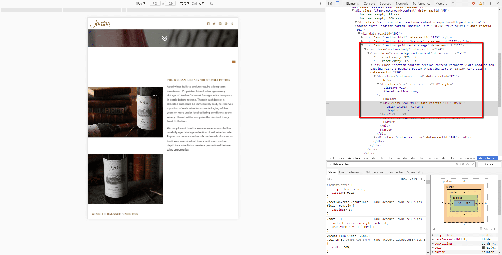
- You can see the result.