Published on 2/6/2019
This tutorial can be useful in following case:
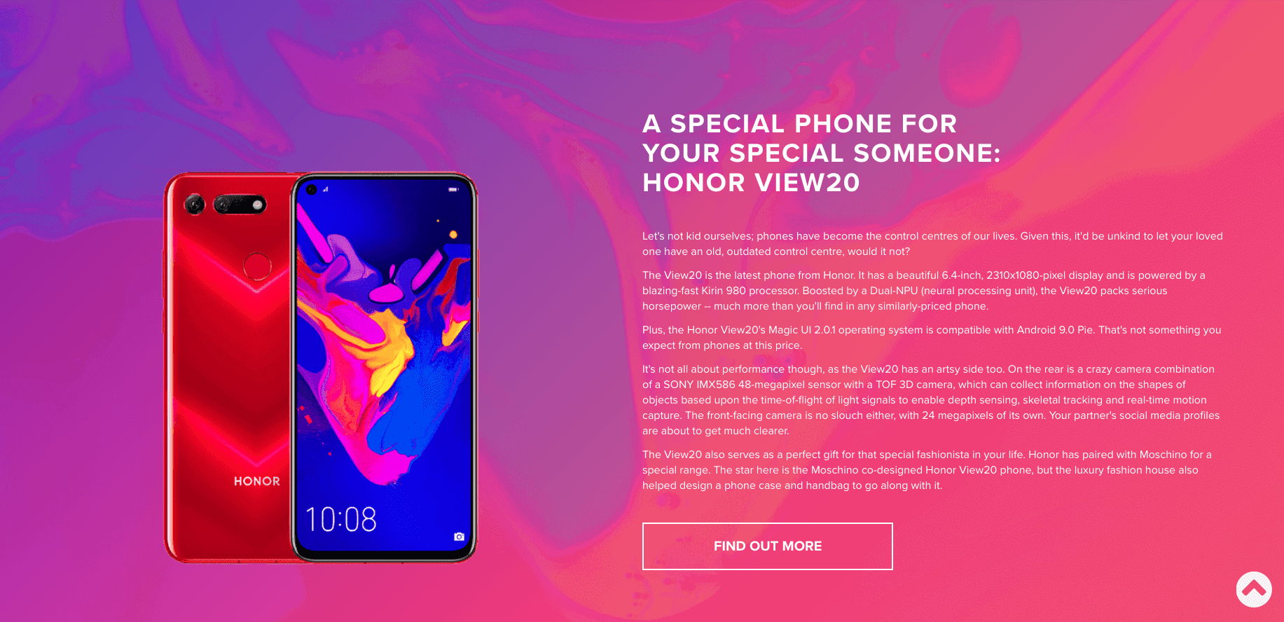
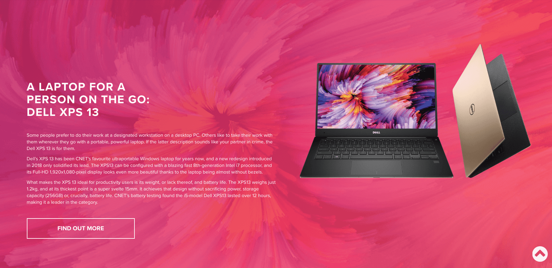
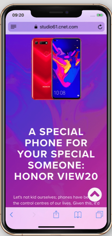
- The first grid containing image on the left and text on the right.
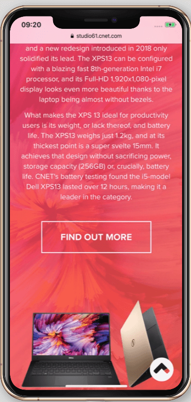
- The second grid containing ext on the left and picture on the right.
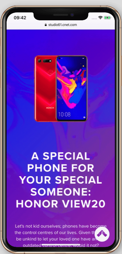
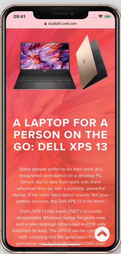
On desktop browser it will look good, but in mobile view the sequence of text and pictures will be different.
Step 1: Add CSS class name to the grid, that need to be fixed in mobile view (in our case it’s a second grid). For example, CSS class name “reverse-mobile”.
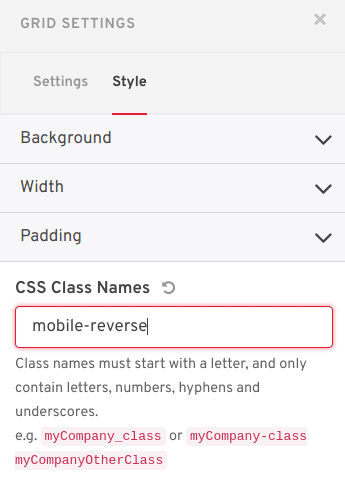
Step 2: In the Story in Code Block next style snippet should be defined for the next CSS selector: “.themed-account .mobile-reverse .row”.
<style>
  @media only screen and (max-width: 768px) {
   .themed-account .mobile-reverse .row {
      display: flex;
      flex-direction: column-reverse;
  }
}
</style>
Step 3: See the result in mobile view.